Sun & Happiness Data Visualisation
This data visualisation shows the relation between amount of sunlight of a country has and the happiness of its inhabitants.
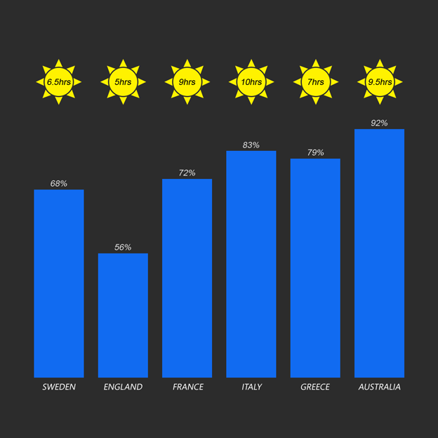
I produced my initial concept and asked a user several questions about it's readability. I asked what they thought the data visualisation showed and everyone knew it had something to do with sunlight hours but they didn’t know what it was in relation to as there wasn’t a key. One user thought that the blue bars in the prototype represented rain instead of happiness, which they were supposed to represent.
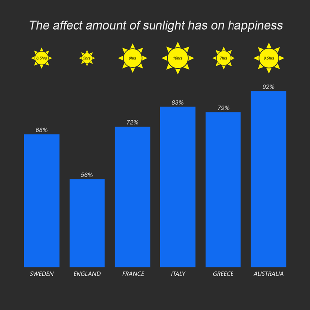
From this feedback I added a title rather than a key because the sun light hours seemed so obvious to the users who gave feedback. Another user mentioned that they thought that it would make a better graphic if the sun hours were symbolised by the size of the sun rather than simply displaying the amount of sun hours. I acted on this feedback by changing the size of the sun in the data visualisation depending on the number of sun light hours but I decided to keep the number in the centre of the sun because I wanted it to remain obvious that they were representing sun light hours, so the second concept was born.
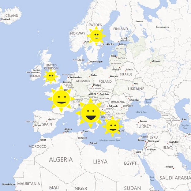
After producing the second concept from the feedback I had collected I then asked the same questions about the updated design. A point came out straight away that if the information were to be displayed on a map it would make it a lot easier to consume and would allow the comparison of countries based on location in the world. A user also made this comment:
“There is a lot of text, as a visualisation it should be mainly visual and should eliminate the need to read much because the visualisation should explain itself.”
From this comment I also decided on removing the sunlight hours and have them display on hover only, incase the user wants to see more precise information. I produced my final concept and transferred the data on to a map, also taking into account all previous user feedback to build a well-developed final concept which displays the information well and can be understood at first glance rather than having to guess what the visualisation was showing like before.


